
There is a moment in every product journey when someone on the team says, "Let's make it better." And while that instinct is not wrong, it often misses the deeper truth about what a great user interface actually requires.
A polished UI is not just a coat of paint. It is an architecture. It is a system of decisions that spans accessibility, performance, state management, error handling, and more. Understanding the Presentation (UI) Layer in its full depth is what separates products that delight users from products that merely function.
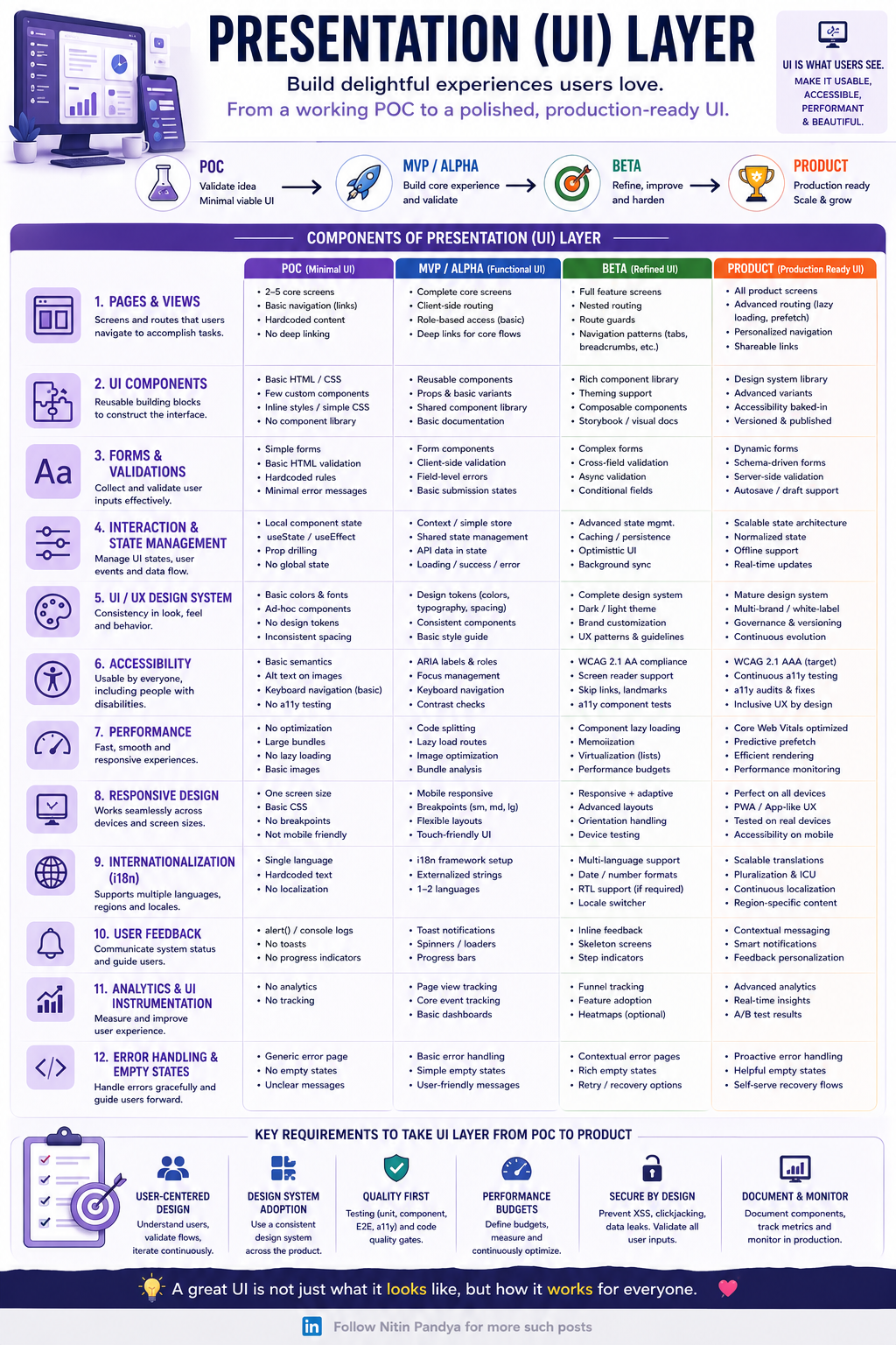
Let us walk through the 12 core components of the UI layer, and how each one evolves from a simple proof of concept to a production-ready product.
Pages, Views, and the Foundation of Navigation
Every UI starts with screens. At the POC stage, you might have two to five core screens with hardcoded content and basic navigation links. That is enough to validate an idea. But as you move toward production, those screens need to support nested routing, route guards, lazy loading, and personalized navigation patterns like breadcrumbs and tabs.
The same evolution applies to UI Components. A POC might rely on basic HTML and CSS with inline styles. A production system has a fully versioned design system library with accessibility baked in, composable components, and visual documentation through tools like Storybook.
Forms and Validations follow a similar path. Simple HTML validation at the POC stage becomes dynamic, schema-driven forms with async validation, cross-field rules, and autosave support at the product level. Each stage adds resilience, and each stage asks more of your team.
State, Design Systems, and the Invisible Layer Users Feel
Interaction and State Management is one of the most underestimated components in UI architecture. Early-stage products often rely on local component state and prop drilling. Production systems need scalable state architecture, normalized data, offline support, and real-time updates.
The UI/UX Design System is what holds everything together visually and experientially. At the POC stage, you are working with basic colors, fonts, and ad-hoc components. By the time you reach production, you need a mature design system that supports multi-brand white-labeling, governance, versioning, and continuous evolution.
Accessibility is where many teams fall short. It is easy to add alt text to images and call it done. But true accessibility means WCAG 2.1 AAA compliance, continuous automated testing, inclusive UX by design, and support for screen readers, skip links, and keyboard navigation throughout the entire application. It is not a checklist. It is a culture.
Performance, Responsiveness, and the Global User
Performance is the silent killer of great products. A beautiful UI that loads slowly is a UI that users abandon. Moving from large unoptimized bundles at the POC stage to Core Web Vitals optimization, predictive prefetching, efficient rendering, and real-time performance monitoring at the product stage is a journey that requires intentional investment at every sprint.
Responsive Design has evolved beyond mobile-friendly layouts. Production-ready UIs support Progressive Web App experiences, are tested on real devices, and handle orientation changes gracefully. Internationalization (i18n) means more than supporting two languages. It means scalable translation pipelines, pluralization logic, right-to-left support, and region-specific content.
User Feedback closes the loop between the system and the person using it. Toast notifications and spinners at the MVP stage become contextual messaging, smart notifications, and feedback personalization at the product level.
Analytics, Error Handling, and the Commitment to Continuous Improvement
The final two components, Analytics and UI Instrumentation and Error Handling and Empty States, are often treated as afterthoughts. They should not be.
Analytics at the production level means real-time insights, A/B test results, funnel tracking, and heatmaps. It means your team is learning from every user interaction and using that knowledge to improve.
Error handling at the product level is proactive, not reactive. It means helpful empty states that guide users forward, self-serve recovery flows, and contextual error pages that do not leave users feeling lost.
Building UI That Works for Everyone
The guiding principle behind all 12 of these components is simple: a great UI is not just what it looks like. It is how it works for everyone.
User-centered design, design system adoption, quality-first thinking, performance budgets, security by design, and continuous documentation are not nice-to-haves. They are the requirements to take your UI layer from POC to production.
If you are building a product today, run your UI layer through these 12 components. Ask where you are in the journey for each one. You will find opportunities you did not know existed, and you will build something users genuinely love.
At NrichSouls, we believe that growth, whether personal or professional, comes from building with intention. And intentional UI is the foundation of every product that truly serves its users.